amazon pharmacy
creative direction
brand design
Amazon Pharmacy is changing the way Americans fill prescriptions —whether they take medication every day or just need a one-time fill. By helping customers make informed decisions and get the meds they need, when they need them. Amazon Pharmacy redefines and delivers a truly customer-centric pharmacy.
Built on a brand promise of convenience, savings, and trust, every piece of brand visuals and messaging should ladder up to these value propositions and relay clear benefits to customers.
amazon pharmacy →
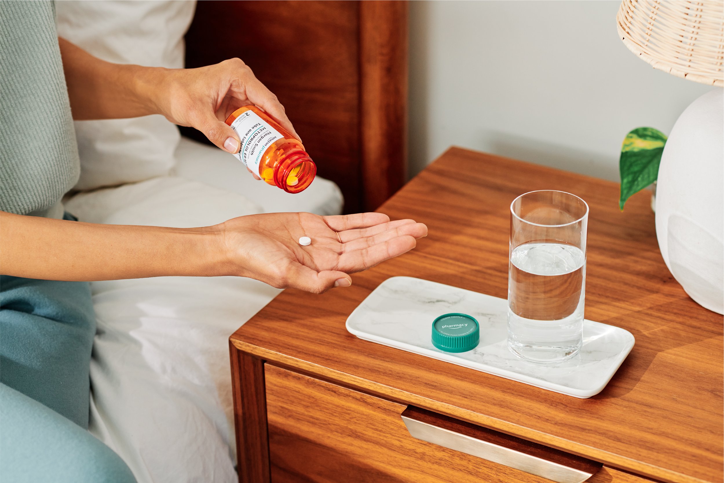
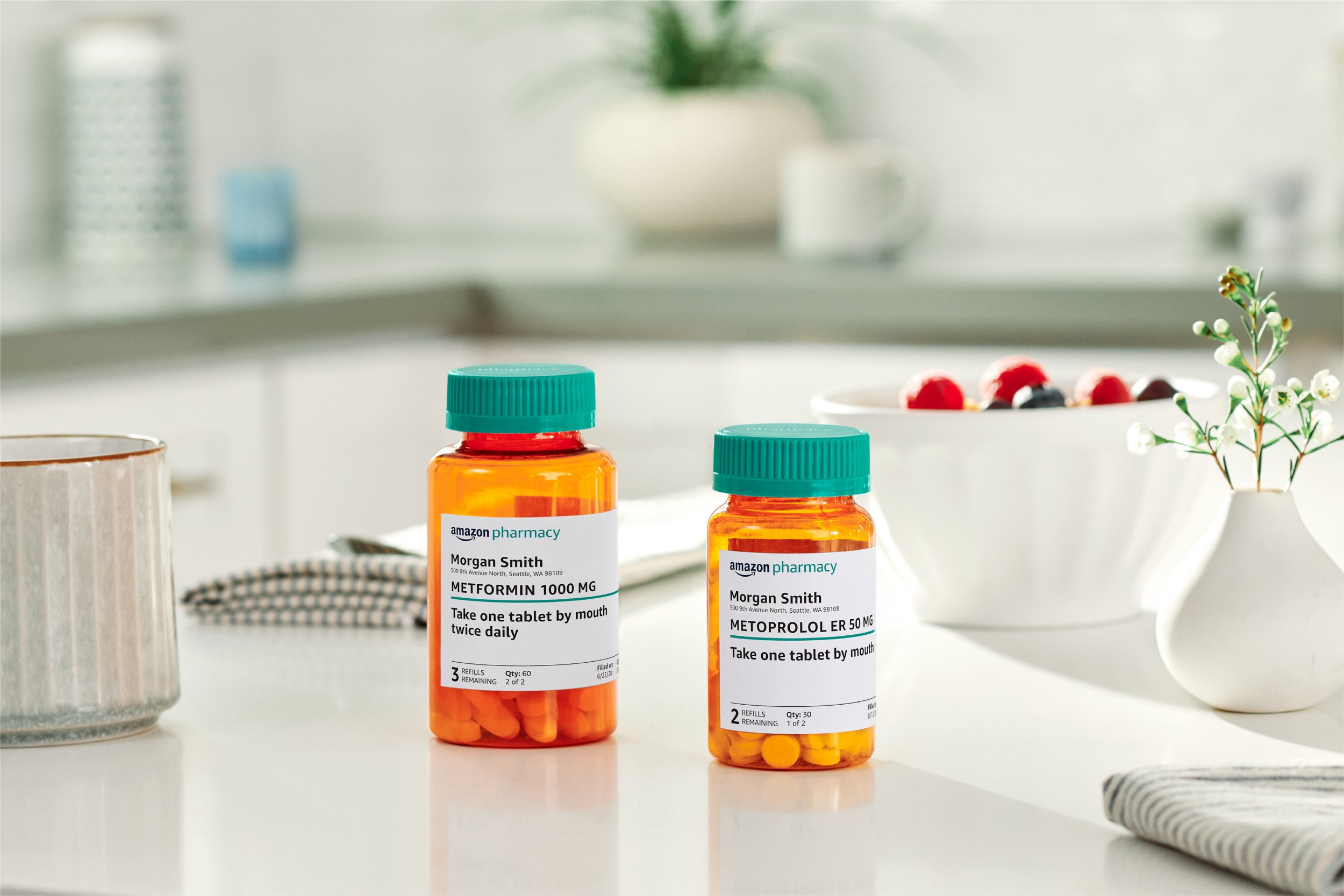
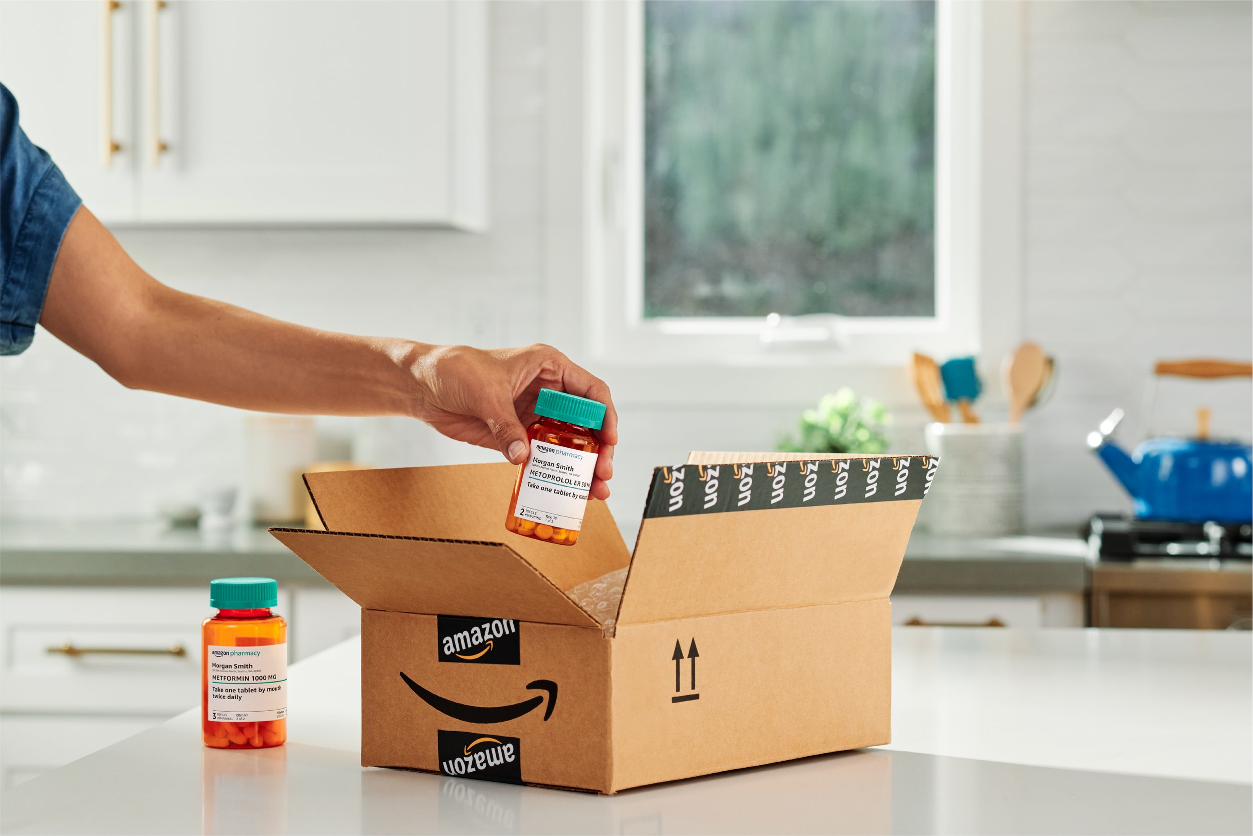
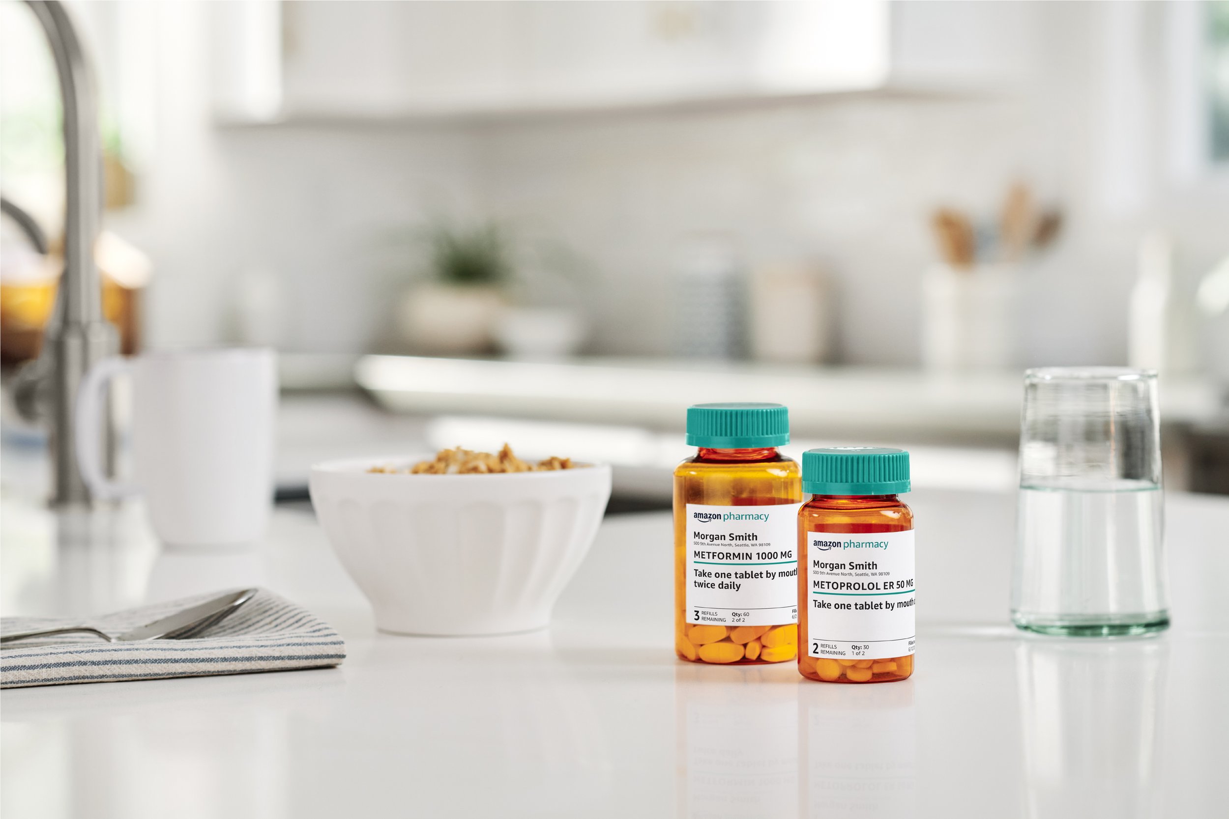
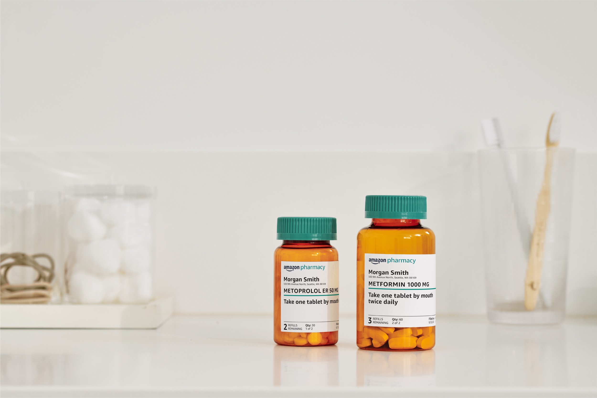
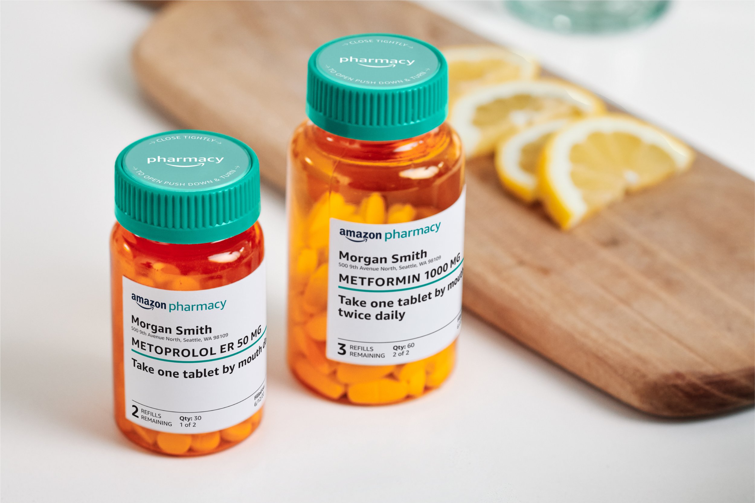
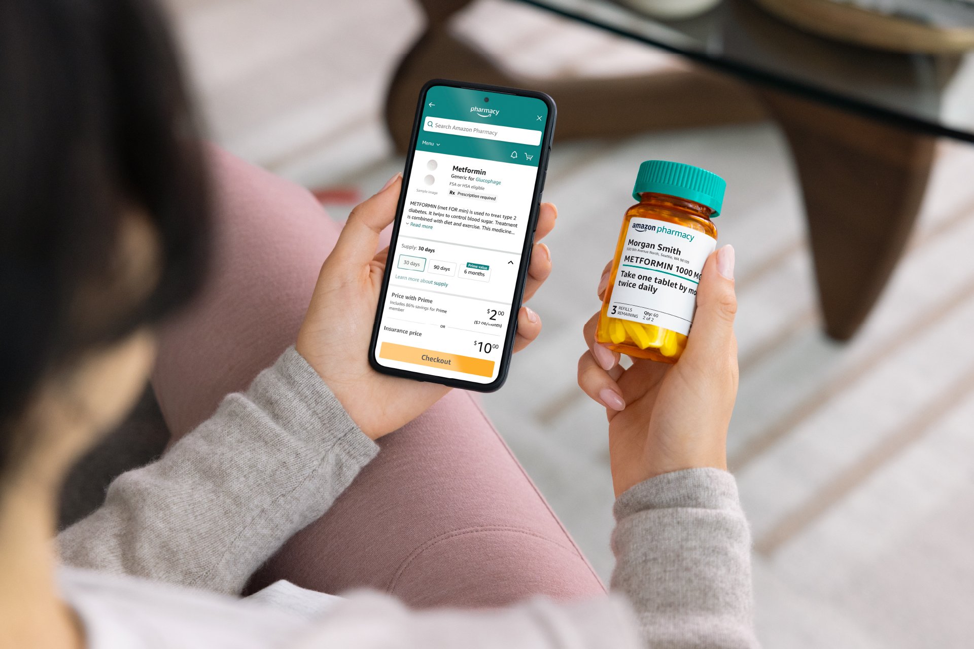
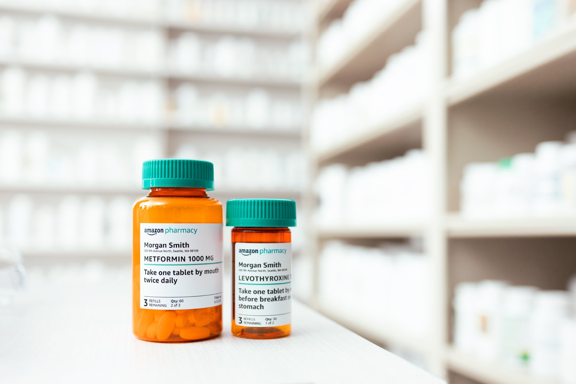
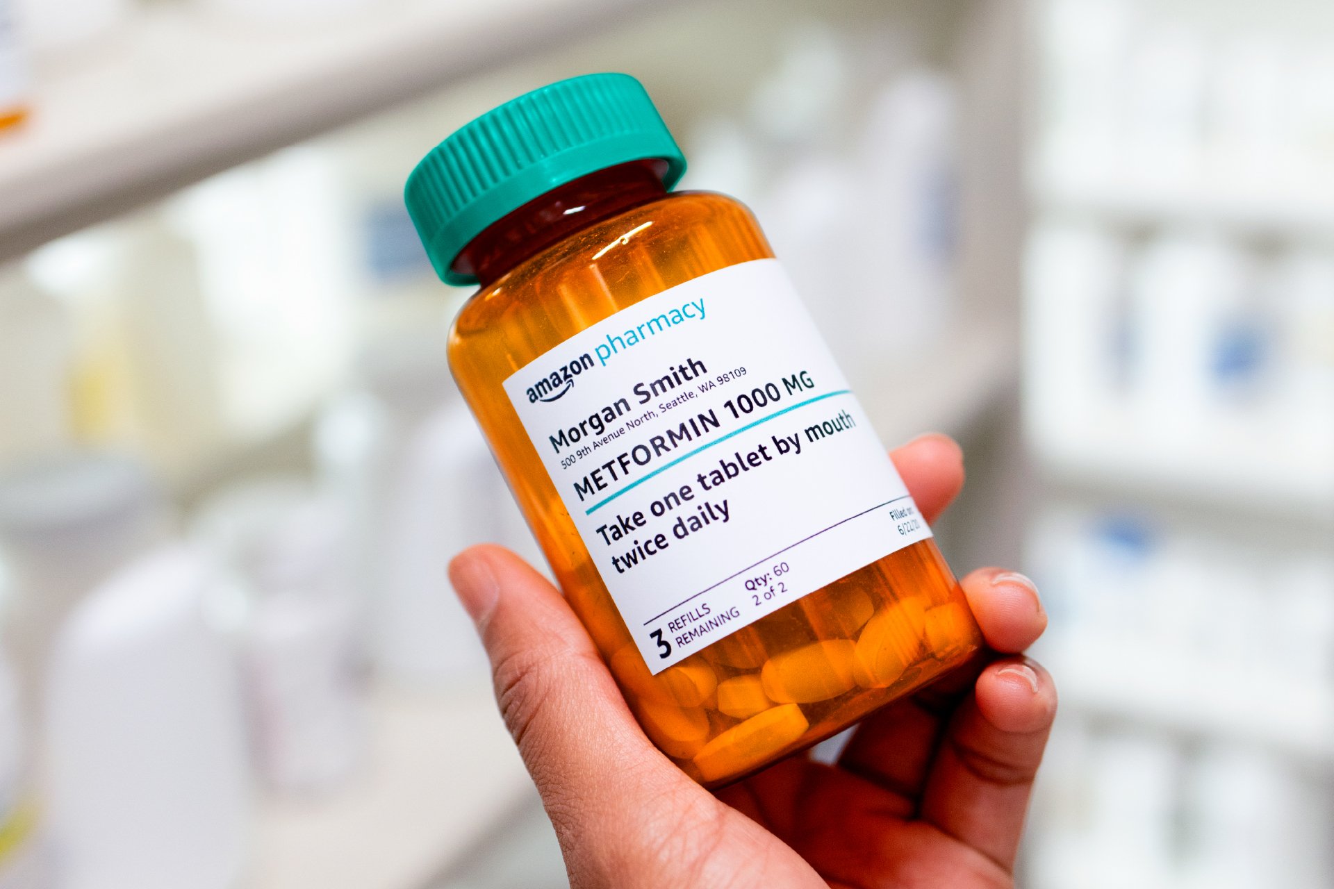
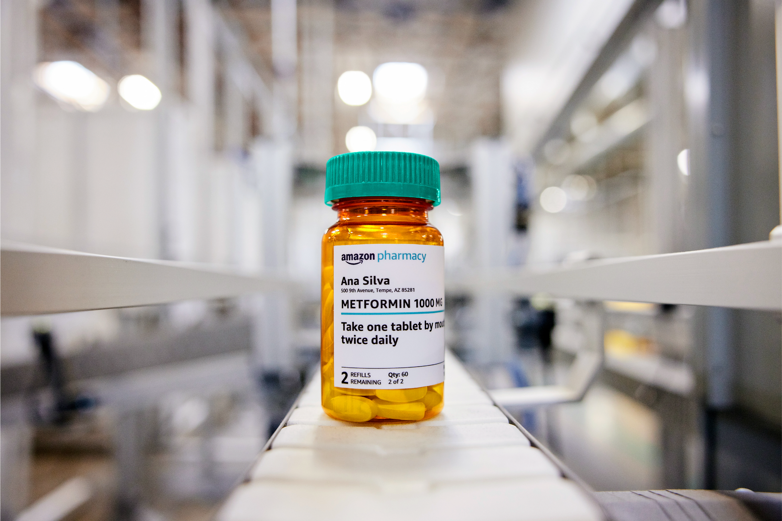
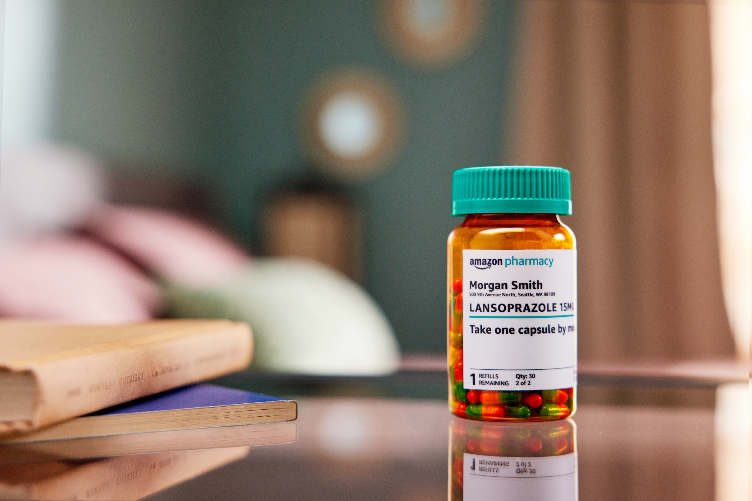
The Amazon Pharmacy pill bottle is the brand’s hero visual—it’s both an easily identifiable representation of ‘pharmacy’ in general, while naturally reinforcing brand recognition.
When it comes to health, people want to see themselves — and know exactly what they’re getting. Photography is used as the primary visual language to closely tie human moments with product benefits through the customer’s point of view.
photographer cara robbins
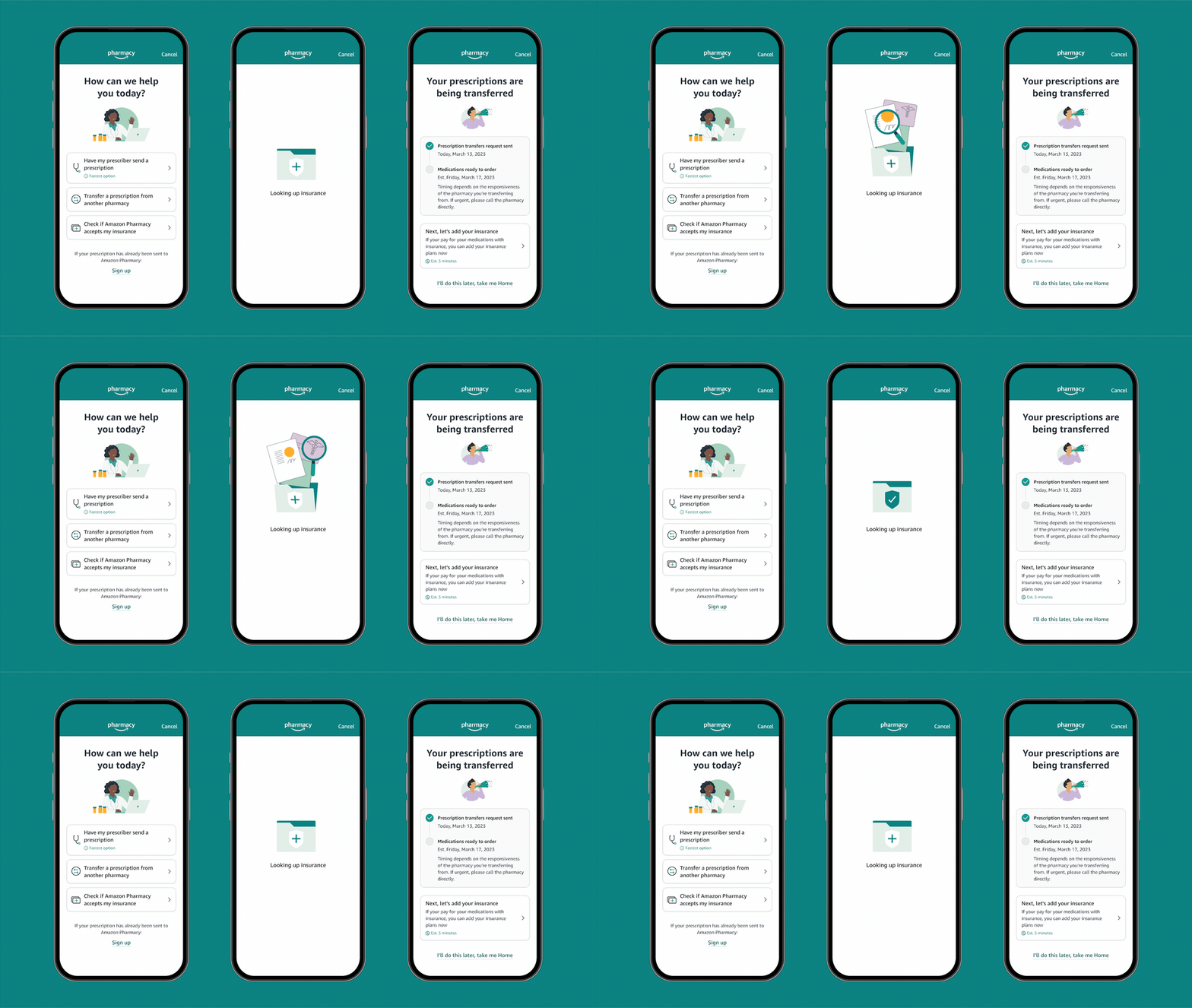
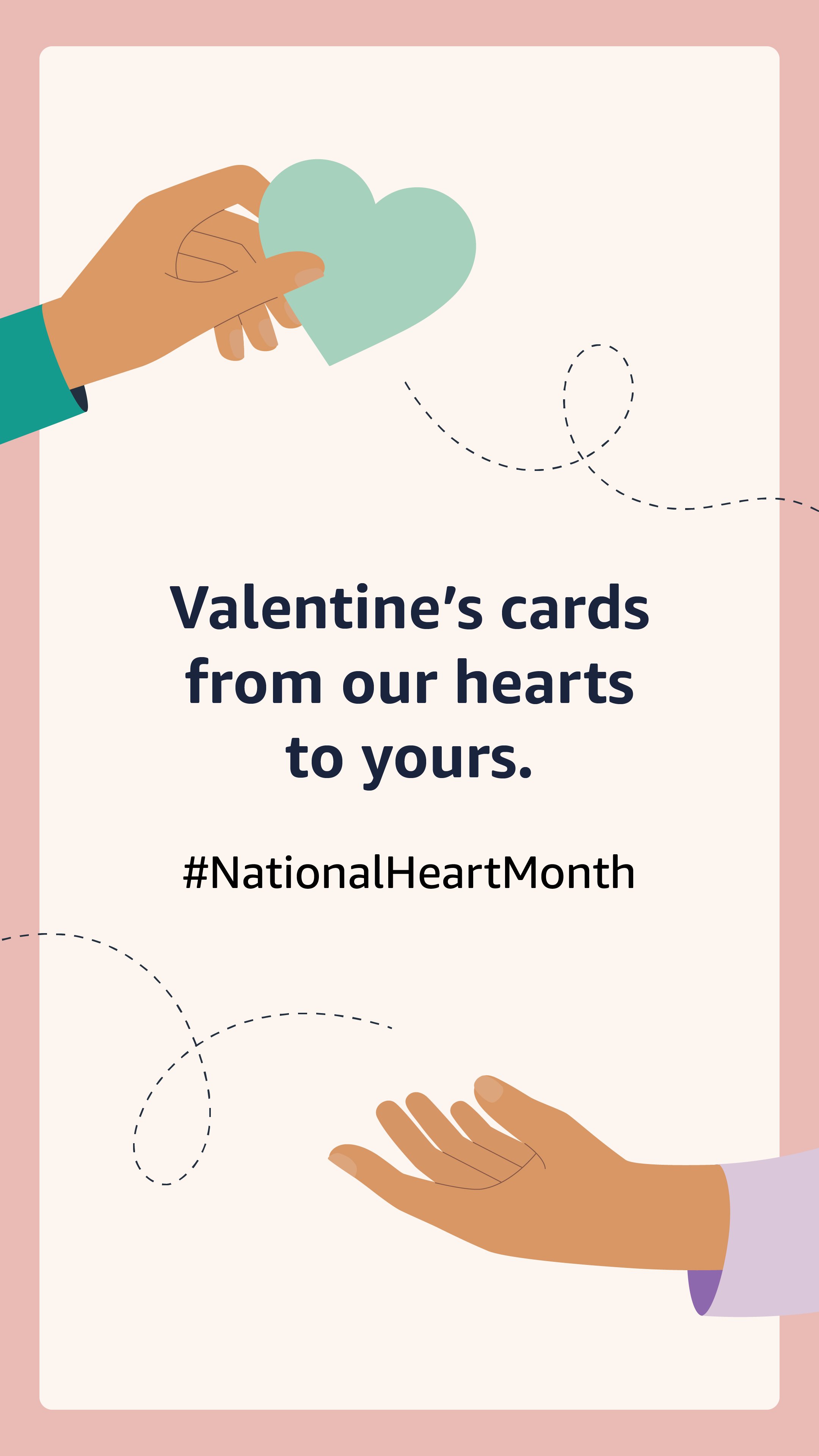
Illustrations are used in a supporting role, primarily to depict an abstract concept, simplify a complex product experience, or bring delight to celebratory moments.
illustrations by marie-christine gervais
save time.
save money.
stay healthy.
Amazon is relatively new to the healthcare space, and few people know they have a pharmacy. Through iconic, ownable product moments infused with emotion, we aimed to build trust with customers and empower them to adopt a better way to shop for meds.
agency partner arts & letters
photographer daniel goldwasser
director ashkan memarian
from your doctor to your doorstep
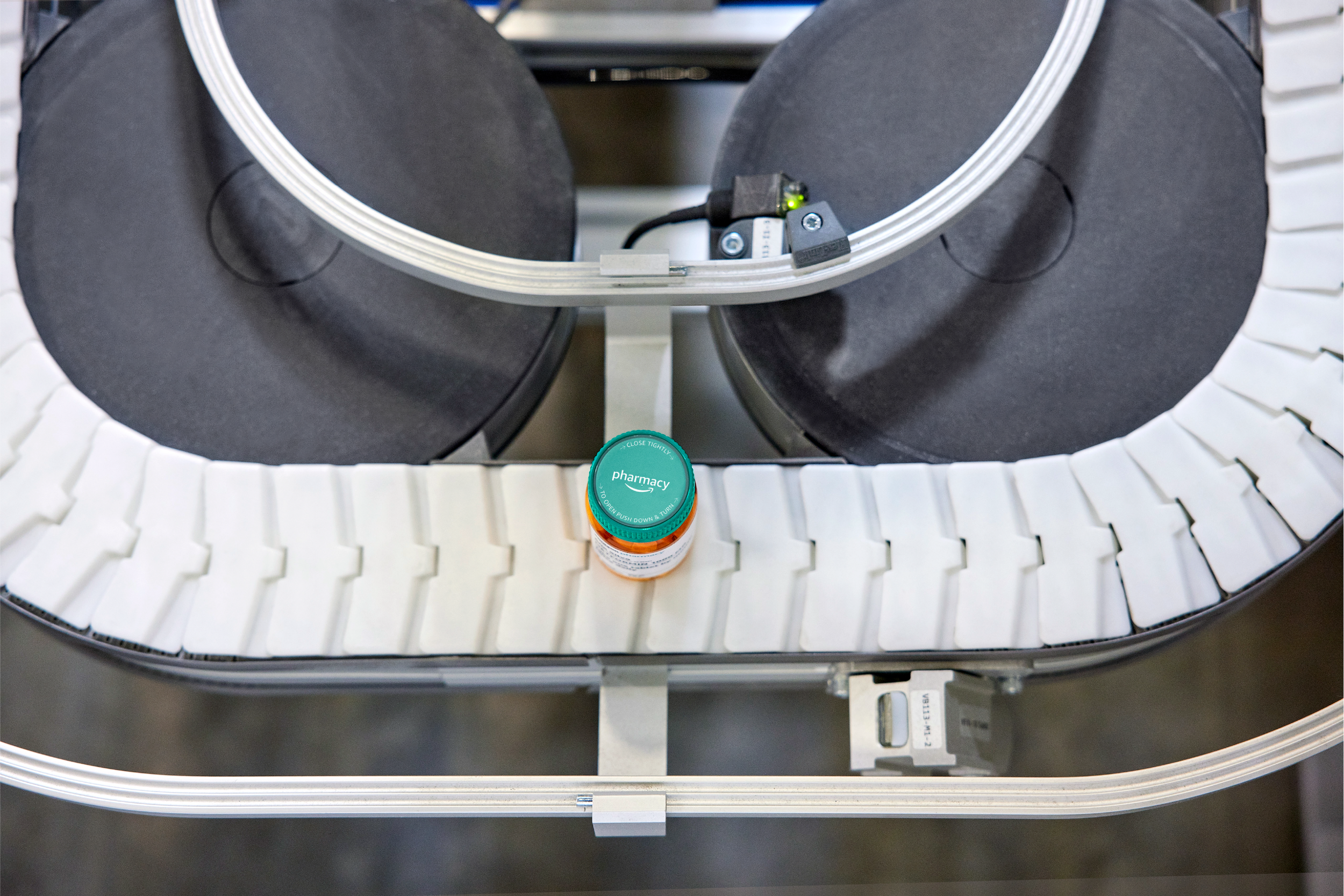
Switching to a new pharmacy isn’t an impulse decision. People need to understand how Amazon Pharmacy works and why it matters before they commit to a new experience. This video helps bring transparency and humanity to the fulfillment process, and what happens after a customer clicks ‘check out’.


